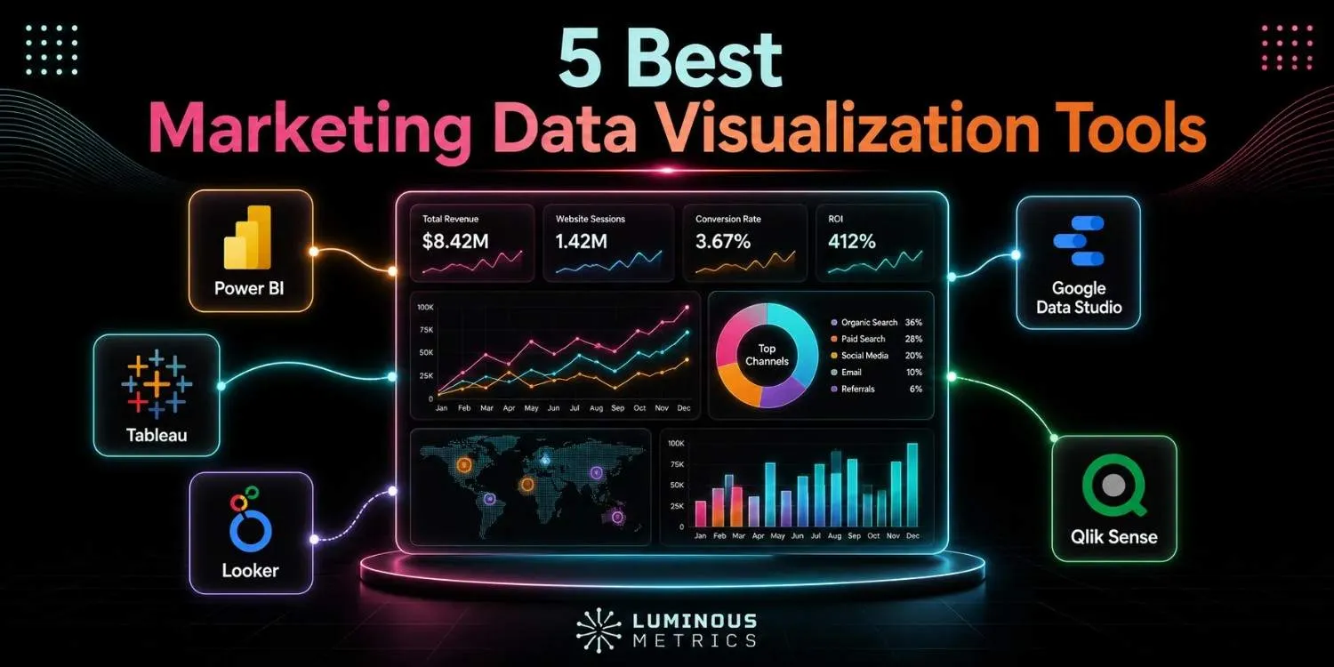
If your team is still pulling data from several ad platforms and piecing it together in spreadsheets, you already understand the problem marketing data visualization tools are designed to solve. They transform complex campaign data into simple, readable dashboards.
We've explored similar reporting challenges in marketing insights before. This time, however, we're focusing on one practical question: which platforms are worth considering?
There is no single tool that works best for every marketing team. The right choice depends on:
- Your team's size
- The channels you manage
- Your budget
- The level of analysis you need
Below, we compare the top five popular data visualization tools for marketing — their strengths, limitations, and the teams they suit best.
What to Look for in Marketing Data Visualization Tools
Before comparing platforms, it helps to understand what makes a marketing data visualization tool genuinely useful. Attractive charts are a nice bonus, but the features behind them matter much more. Here are a few things to look for:
- 1Connector coverage: Can the tool pull all the metrics your team actually needs?
- 2Data transformation: Can it clean the data, remove duplicates, and handle different currencies?
- 3Revenue integration: Can it connect advertising spend to leads, sales, and closed revenue?
- 4Refresh frequency: Daily updates may be enough for executive reports, while campaign monitoring often requires fresher data.
- 5Total cost: Connector fees, user seats, and additional features can quickly increase the overall price.
What Are the 5 Best Marketing Data Visualization Tools?
Even the most polished dashboard cannot make up for inaccurate or poorly organized data. With these factors in mind, let's explore the best marketing data visualization tools.
1. Microsoft Power BI
Power BI is a strong choice for marketing teams that need advanced data modelling without paying enterprise-level prices. While working smoothly with Microsoft 365 and Azure, it supports:
- Calculated metrics
- Detailed drill-downs
- Row-level security
Power BI Desktop is also free for building reports, and its Pro version starts at $14 per user per month when billed annually. It's especially useful for tracking ROAS, monitoring budget pacing, and combining advertising data with CRM or financial information.
One limitation: Power BI is not designed specifically to collect marketing data from every platform. To bring in clean data from sources such as Meta Ads or TikTok, many teams use it alongside connectors like Funnel or Supermetrics.
2. Tableau
Tableau is a great option for teams that want to explore their data rather than simply report on it. It lets analysts move quickly between different dimensions, uncover patterns, and turn their findings into clear visual stories for stakeholders. This makes it particularly useful for marketing teams with dedicated data analysts.
The platform connects to hundreds of data sources, including Google Analytics and BigQuery, to visualize marketing data. It's especially well suited to customer segmentation, journey mapping, and polished executive presentations.
Tableau is more expensive than Power BI:
- Creator costs $75 per month when billed annually
- Explorer costs $42
- Viewer costs $15
3. Luminous Metrics (Lumis AI)
If you run a marketing agency or manage a growing brand in the MENA region, you're probably familiar with the challenge: performance data spread across Meta, Google, TikTok, Snapchat, and other platforms — endless CSV exports and dashboards that were not designed with Arabic-speaking teams or regional businesses in mind.
Lumis AI, a fully AI-based marketing intelligence platform, was created to solve these problems. It gives agencies and brands a clearer, simpler way to understand their marketing performance while addressing the specific needs of the MENA market. You can try it with a free trial.
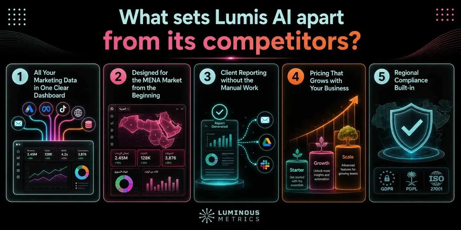
It also has some specific characteristics that set it apart from its competitors:
All Your Marketing Data in One Clear Dashboard
Lumis AI brings performance data from Meta, Google, TikTok, Snapchat, and other channels into one unified view. Instead of switching between platforms or manually combining spreadsheets, your team can see what is working, what is not, and where to focus next.
Designed for the MENA Market from the Beginning
Rather than adapting a global platform for regional users, Lumis was built around their needs. It supports Snapchat Ads analytics, Arabic right-to-left layouts, and regional e-commerce platforms such as Salla and Zid. Arabic isn't treated as an extra feature; it's part of the platform's core design.
Client Reporting without the Manual Work
Lumis lets agencies create automated, white-labelled PDF reports in Arabic or English and send them on their preferred schedule. Less time downloading data and building reports, and more time analyzing results and supporting clients.
Pricing That Grows with Your Business
Whether you're a freelancer, an independent consultant, or a growing agency, Lumis offers plans designed for different stages of growth. Users can start with the free trial and move to more advanced white-label agency options as their reporting needs expand. See pricing.
Regional Compliance Built-in
The platform was developed with UAE and Saudi data-protection requirements in mind. This helps agencies and brands manage regional client data with greater confidence while addressing important considerations such as consent and data residency.
Luminous Metrics — a marketing agency with content-production and SEO experts — combines clear marketing data visualization with the regional understanding that many global platforms lack. It's marketing intelligence built for the way businesses in the MENA region actually work.
4. Google Data Studio
Renamed from Looker Studio in April 2026, Google Data Studio offers a simple drag-and-drop editor, calculated fields, and direct connections to Google Ads, GA4, Search Console, and YouTube Analytics.
Its biggest strength is how smoothly it works with the wider Google ecosystem. However, as your reporting needs become more complex, its limited governance and data-modelling capabilities may become restrictive. GA4 reports can also be affected by API quotas.
For many teams, Data Studio is a practical place to build and test dashboards before moving to a more advanced platform.
5. AgencyAnalytics
AgencyAnalytics is designed specifically for how marketing agencies operate, rather than for general-purpose data analysis. Plans include unlimited data sources, dashboards, and client users, plus more than 85 integrations. Pricing starts at $20 per client per month when billed annually.
Its main strengths include automated client reporting, white-labelled dashboards, dedicated client portals, and quick onboarding across multiple accounts. It isn't the best choice for complex statistical analysis or advanced data modelling, but most agencies managing several clients are unlikely to see that as a major drawback.
Pros & Cons at a Glance
A side-by-side view of what each of the five tools does well — and where they fall short.
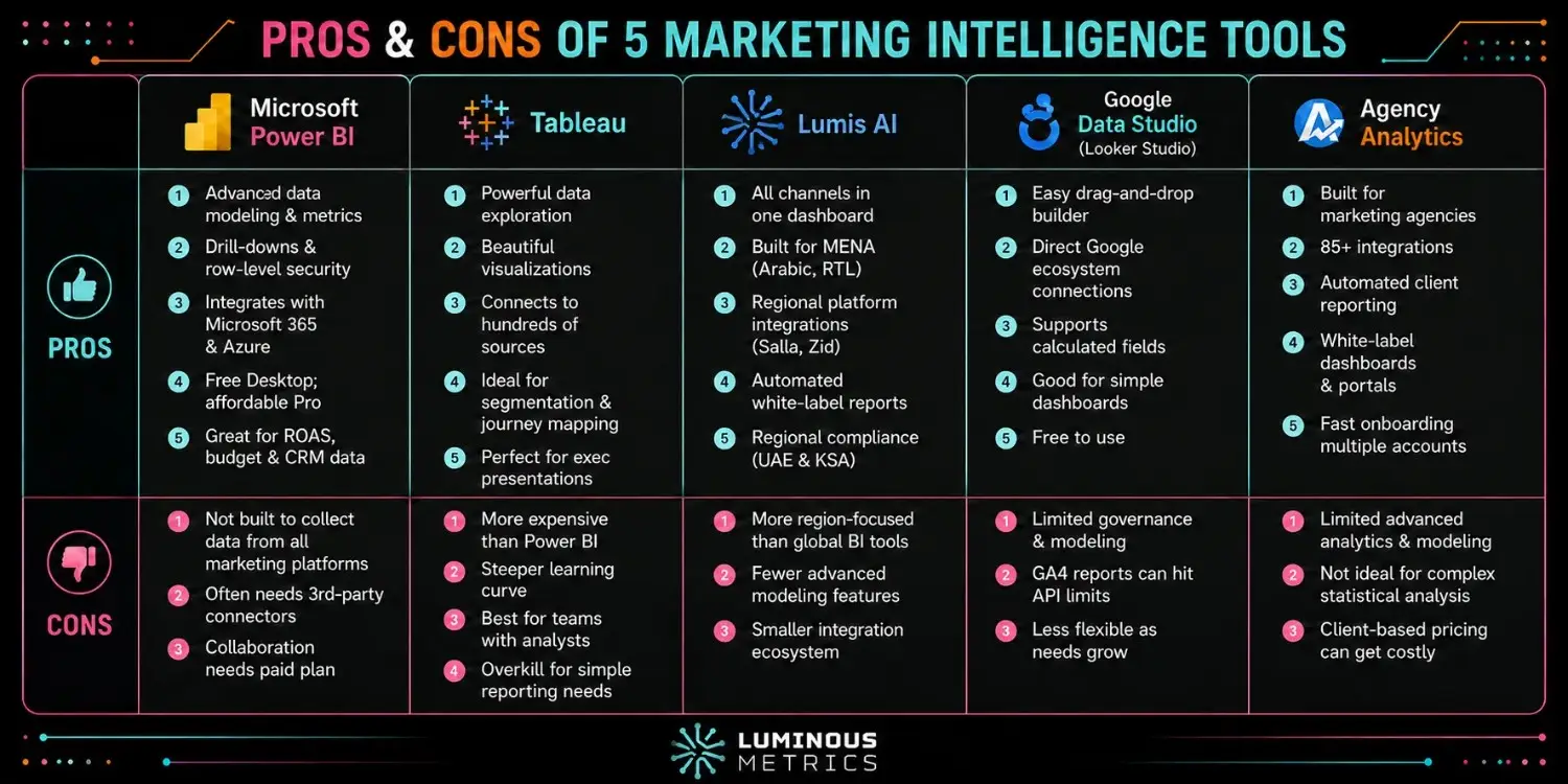
With this marketing data visualization tools comparison, you have a clearer picture for choosing the best one for your business's real needs.
Conclusion on the Best Marketing Data Visualization Tools
The best marketing data visualization tool isn't necessarily the one with the longest list of chart types. It's the one that fits the way your team actually works.
- Power BI and Tableau are well-suited to teams that have the time and expertise to build detailed data models.
- Data Studio and AgencyAnalytics are better for teams that value speed, simplicity, and easy reporting.
- For agencies and brands in the MENA region, Luminous Metrics (Lumis AI) also addresses regional needs that many global platforms weren't designed to support.
Whatever tool you choose, the aim is the same: spend less time downloading CSV files and more time using your data to make better decisions.
Bring clarity to your marketing performance.
Get in touch with Lumis and discover your next best move.
Start Free TrialFAQs on Marketing Data Visualization Tools
Do I need a separate data connector if I already have a visualization tool?
Often, yes. Power BI and Tableau are excellent visualization tools, but they work best when the underlying data is already clean and consistent. Many teams therefore use them alongside connectors such as Funnel or Supermetrics, which collect data from advertising platforms, remove duplicates, standardize currencies, and prepare the information for reliable reporting.
What are marketing data visualization AI tools?
Marketing data visualization AI tools help teams make sense of their data without needing technical skills such as SQL or coding. They can automatically create charts, highlight important trends, and even offer predictions about future campaign performance. By connecting with platforms such as Google Analytics or HubSpot, these tools turn raw marketing data into clear, polished dashboards that are easy to understand and ready to share with clients or colleagues.