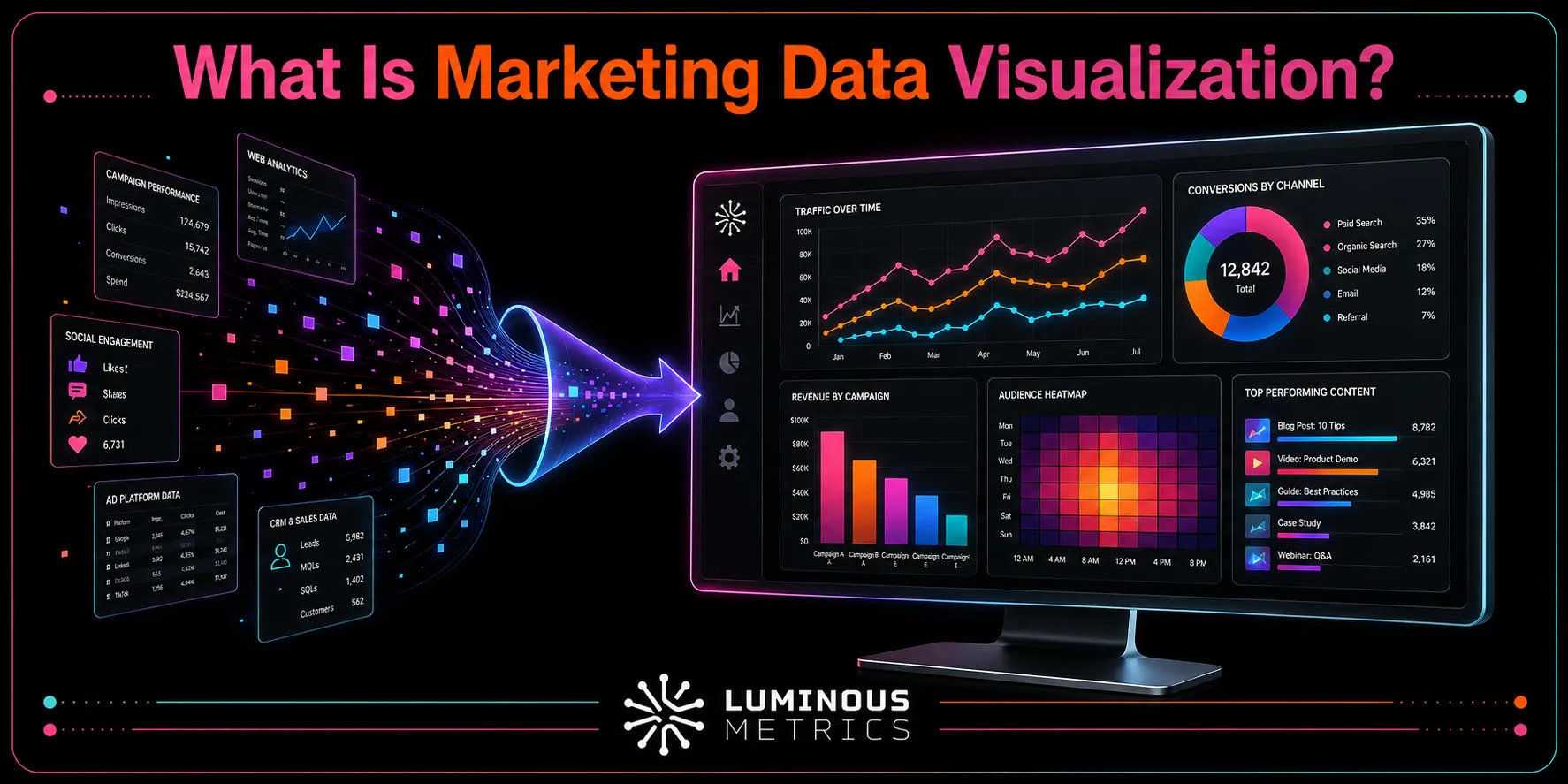
Many business owners and marketers rely on visualized data to get a clear picture of how their business is performing. Marketing data visualization brings access to more data than ever to life by turning scattered campaign metrics into clear:
- Charts
- Graphs
- Dashboards
When used effectively, it helps teams uncover trends, measure ROI, identify opportunities, and make faster decisions without spending hours working through spreadsheets.
Even without an enterprise-level budget, the right reporting approach can make your marketing data far more useful. At Luminous Metrics, a fully AI-powered marketing service, we aim to make ourselves the world's most trusted source of marketing strategies and insights for businesses in emerging markets — built with data sovereignty at its core in the UAE, powered by AI from day one, and trusted by companies around the world.
So, what does marketing data visualization involve, and how can your team use it effectively? Let's take a closer look.
What Is Marketing Data Visualization?
Marketing data visualization is the process of turning metrics such as website traffic, conversions, and advertising spend into clear charts, graphs, and dashboards. Rather than working through endless rows of numbers, you can quickly see patterns, trends, and changes in performance.
It combines data from multiple sources, including your:
- CRM
- Website analytics
- Advertising platforms
- Email tools
- Social media channels
Once this information is combined, it creates a clear visual story that everyone on your team can understand.
The purpose isn't simply to make data look more attractive. It helps teams understand performance and make faster, better-informed decisions. Research suggests that effective dashboards can help businesses make decisions up to 5× faster while reducing reporting time by up to 80%.
Why Data Visualization in Marketing Matters
Marketing data comes from everywhere — clicks, impressions, email opens, conversions, and countless other interactions. But without a clear way to organize and understand it, all that information has little practical value.
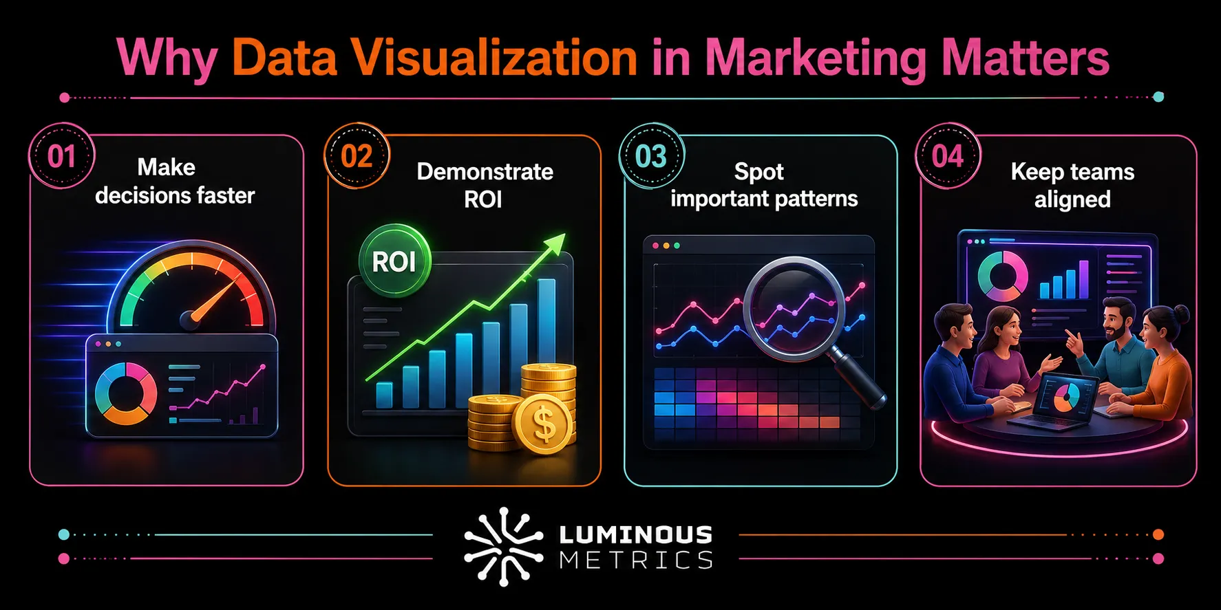
Effective marketing data visualization helps your team:
- 1Make decisions faster: A clear chart is much easier to understand than a spreadsheet with dozens of tabs.
- 2Demonstrate ROI: Visual reports show stakeholders which channels and campaigns are delivering results.
- 3Spot important patterns: Trends, seasonal peaks, performance drops, and emerging opportunities become easier to identify.
- 4Keep teams aligned: From interns to senior executives, everyone can work from the same clear view of performance.
This is especially important in data visualization in digital marketing, where the number of channels can grow quickly. Paid advertising, organic search, email, and social media each produce their own metrics — and without effective visualization, comparing their performance and understanding how they work together can be difficult.
Key Metrics Worth Visualizing
Not every metric needs its own chart. The most useful visualizations focus on KPIs that connect directly to your business goals, such as:
- Traffic and reach: sessions, impressions, and unique visitors
- Engagement: click-through rate (CTR), bounce rate, and email open rate
- Cost efficiency: cost per click (CPC), cost per lead (CPL), and customer acquisition cost (CAC)
- Conversions and revenue: conversion rate, return on ad spend (ROAS), and overall ROI
- Customer value: lifetime value (LTV), churn rate, and customer retention
Together, these metrics cover the entire customer journey — from the first interaction to repeat purchases. The right ones to track will depend on which stage of the marketing funnel data visualization you're trying to improve.
Where the Data Comes From in Marketing Data Visualization
Before you start building charts, you need to make sure the data behind them is accurate, consistent, and properly connected. Most marketing teams collect data from several sources, including:
- Web analytics platforms: Google Analytics and Adobe Analytics
- Advertising platforms: Google Ads, Meta Ads, and LinkedIn Ads
- Email and CRM tools: HubSpot, Mailchimp, and Salesforce
- Social media analytics: performance data from your social channels
The challenge is that these platforms often organize and define their data differently. To create a single view of the data, teams use ETL processes (extract, transform, and load) to collect, clean, standardize, and combine the information into a single reliable dataset.
This step is really vital — without it, even a well-designed dashboard can display inconsistent, inaccurate, or misleading results.
At Lumis AI, our strategies and insights combine the power of AI with local expertise that global platforms often overlook. With the average organization using 106 SaaS applications, marketing data can quickly become scattered and difficult to manage. What we do is simplify the complexity by bringing everything together into one clear and reliable source of truth.
Common Chart Types for Marketing Reports
When it comes to data visualization in marketing reports, the chart type should match the story you're telling:
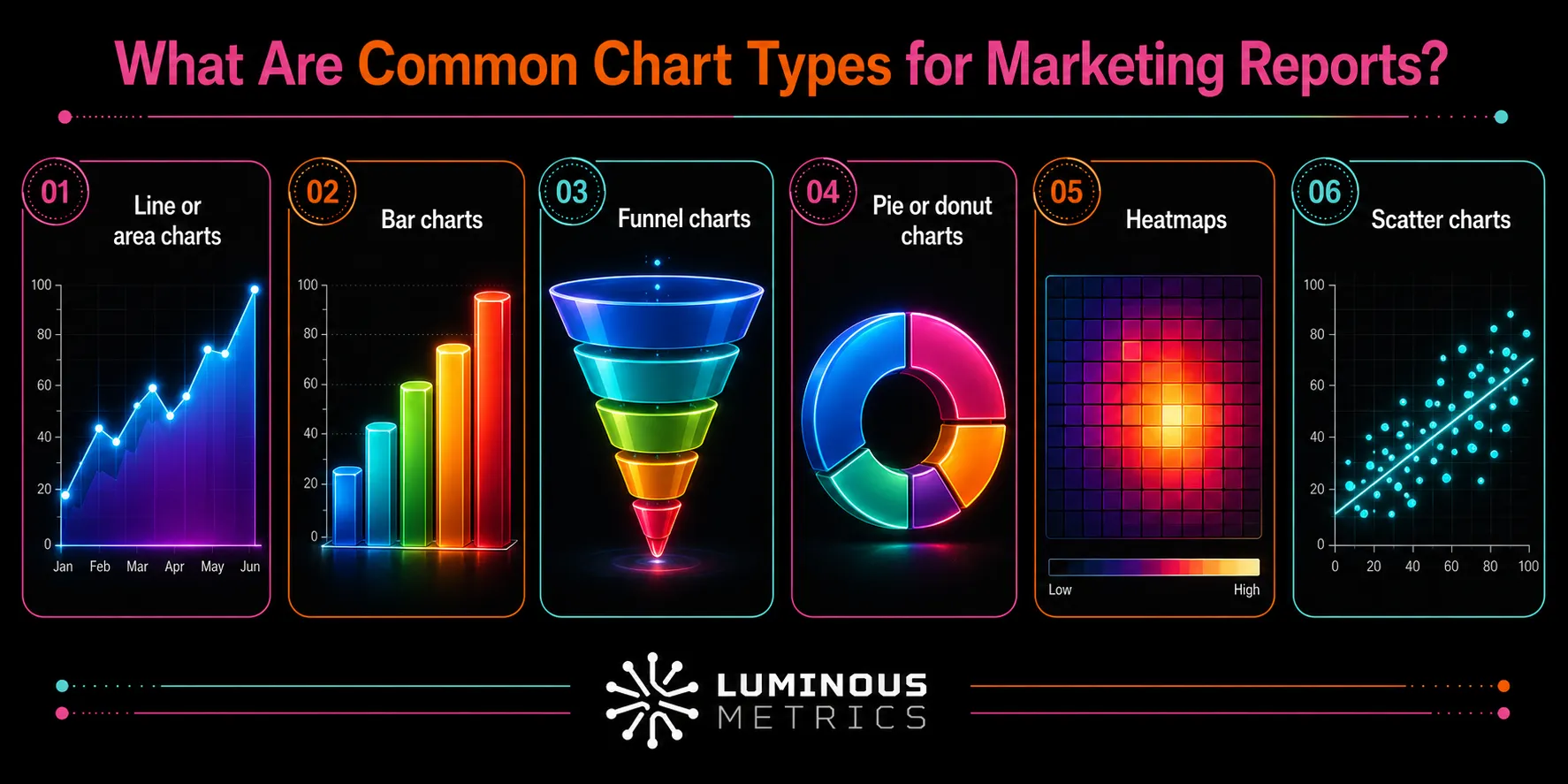
- Line or area charts: Best for showing trends over time, like monthly traffic or conversions.
- Bar charts: Ideal for comparing categories, such as leads by channel.
- Funnel charts: Show exactly where prospects drop off between stages.
- Pie or donut charts: Use sparingly — only for simple proportions like budget splits.
- Heatmaps: Useful for spotting patterns, like peak engagement hours.
- Scatter charts: Great for comparing two metrics, like cost versus conversion rate.
A practical general guideline: time-based data gets a line chart, comparisons get a bar chart, and stage-based data gets a funnel.
Data Visualization Dashboards for Marketing
Data visualization dashboards for marketing combine several automatically updated charts into one clear view, reducing the need to rebuild reports. Effective dashboards:
- Focus on a few relevant KPIs
- Match the needs of their audience
- Present information from broad insights to detailed analysis
Keeping the design simple helps prevent confusion. For a deeper look at the tools that power these dashboards, see our roundup of the 5 best marketing data visualization tools.
Last Words on Marketing Data Visualization
Marketing data visualization isn't simply about creating attractive charts. It gives your team a clearer view of performance and the next steps to take.
- Start with accurate and well-organized data
- Choose the right visual for the message you want to communicate
- Keep your dashboards focused on the metrics that matter most
As your marketing expands across more channels, this clarity helps you move beyond guesswork and understand what is truly driving results.
Ready to start your story?
Get in touch with Luminous Metrics and turn scattered marketing data into decisions.
Start Free TrialFAQs About Data Visualization for Marketing
Is marketing data visualization only useful for large teams?
Not at all. Smaller agencies may benefit even more from clear dashboards because they reduce the time spent manually preparing reports for different clients. This gives teams more time to focus on analysis, strategy, and improving campaign performance.
How often should a marketing data visualization dashboard be updated?
It depends on the channel. Paid campaigns may need daily or even real-time monitoring, while broader brand performance can usually be reviewed weekly or monthly.